When we visit an online store or website and browse around, we don’t think about the reason why it looks like it does. What makes it that you see the “Buy” option green and the background light and serene?
Why are advertisements so often using the color orange or red? Actually, design isn’t just about aesthetics. It’s a language of visuals that can influence our thoughts actions, choices and behaviors. One of the most effective instruments of this language is the color. The psychology behind color can help us understand how colors can increase trust, stimulate actions, and ultimately boost sales.
Table of Contents
What is the significance of color?
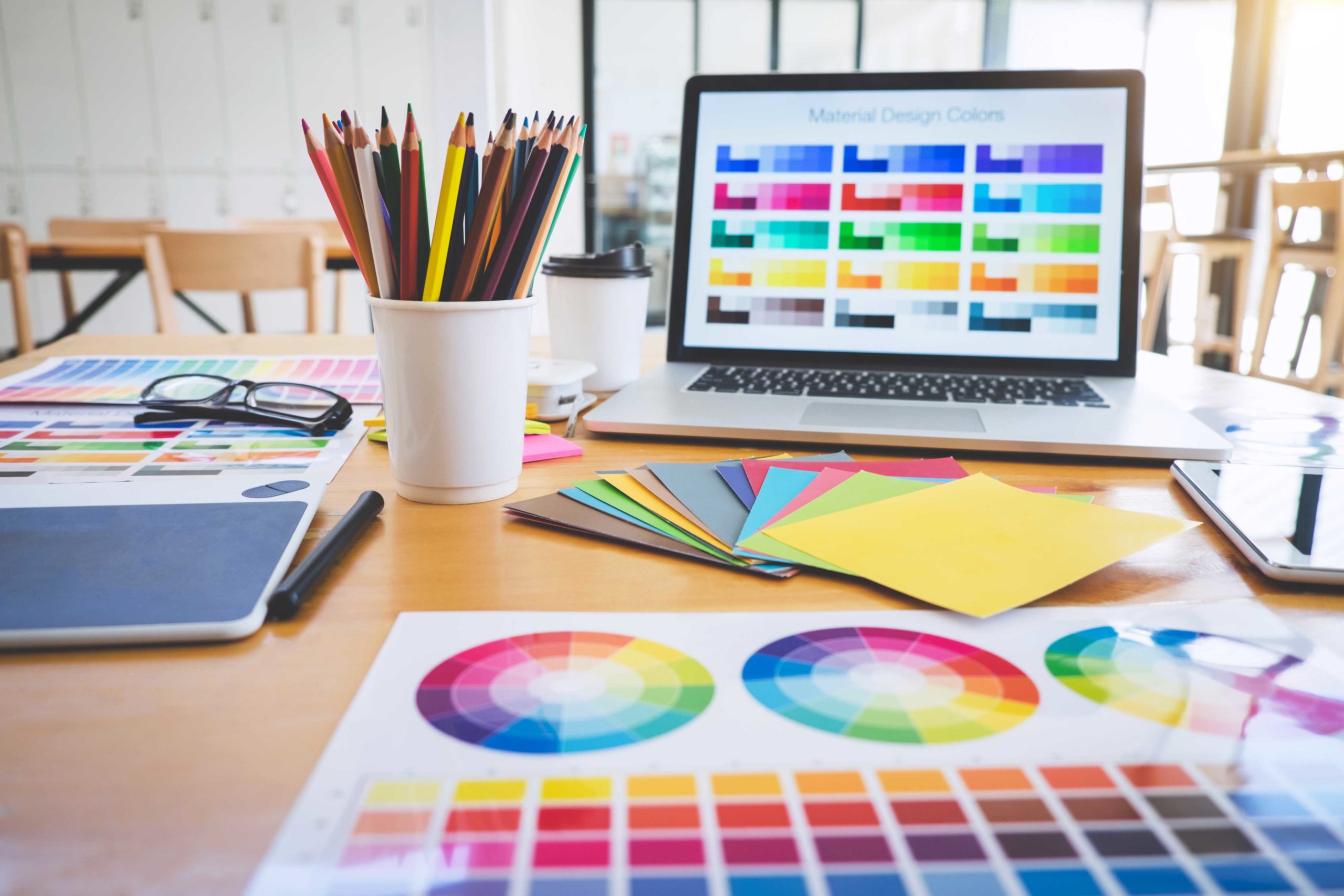
Colors affect the brain more quickly than images or text. The first impression is formed in a fraction of a second and colors often decide the length of time a person decides to stay or leave. It is because colors trigger emotions. Warm colors stimulate and excite and energise, while cool tones relax and signal professionalism. A carefully selected palette can help strengthen the branding of the company and help users navigate their way through interfaces, making the interaction enjoyable.
However, color doesn’t perform on its own. It is the context that matters as do audience expectations, culture and the field of business all influence perception. A color that is the same can have different meanings in different countries. For instance, white is a symbol of purity in Western cultures, whereas in certain Asian nations, it is a symbol considered to be a symbol of mourning. Designers must therefore be aware of both psychological and cultural subtleties.
The effects of emotions and associations Color and emotions: how colors influence the way we behave
When designing websites, colors are used to create mood and emotional signals. Blue symbolizes stability and reliability and stability, which is why it is a favorite among banks and IT firms. Red signals excitement, urgency or even danger which is why it is a great choice for promotions to sell. Green is a sign of confidence, tranquility and security which makes it a great option for buttons that call to action and financial services. The colors orange and yellow are arousing and encourage impulse choices.
Color affects not just the perception of a brand, but also user behavior. Just changing hue of the click can improve conversion rates significantly. This isn’t magical, but it is the result of contrast and glare. But too many bright colours can make a user feel overwhelmed and cause confusion, therefore balance is crucial.
Balance between brand identity and satisfaction
A well-designed interface doesn’t make the user feel pressured. It provides the illusion of clarity and simplicity. Colors that are harmonious, pleasant contrast and an orderly layout create a sense of security. When the colors are cluttered or excessively intense no matter if the person is unable to identify the reason, they could be uncomfortable and leave the page.
The palette should reflect the essence of the business. A business that is focused on professionalism should choose cool, calming tones. Brands that target a young, enthusiastic audience could select vibrant colours. The goal isn’t simply to grab attention but also to communicate the right emotional message.
What is the role of color in sales?
A well-chosen color scheme can increase sales, but not just by enhancing the visualizing the action elements. It creates a sense of emotional readiness to buy. Relaxation and confidence aid in decision-making while curiosity and excitement increase interaction; the urgency boosts decision-making. This is the reason why many businesses try to test minor design changes Every detail affects the way that people convert.
Conclusion
Color psychology can be a useful technique for influencing the users’ experience and enhancing results for business. It can help communicate emotions create a sense of perception and boost conversions. So, companies must consider not just the functionality of their website, but also the atmosphere of emotion it creates.


